How to use ion-skeleton-text in Ionic 4

No comments

ion-skeleton-text

Skeleton Text is a component for rendering placeholder content. The element will render a gray block at the specified width.

Skeleton screens… You might think they sound a little scary and or that they’re hard to implement, but what if I told you that they are actually quite simple to make. Once added to your app, skeleton screens become an awesome feature to make your app feel incredibly fast.
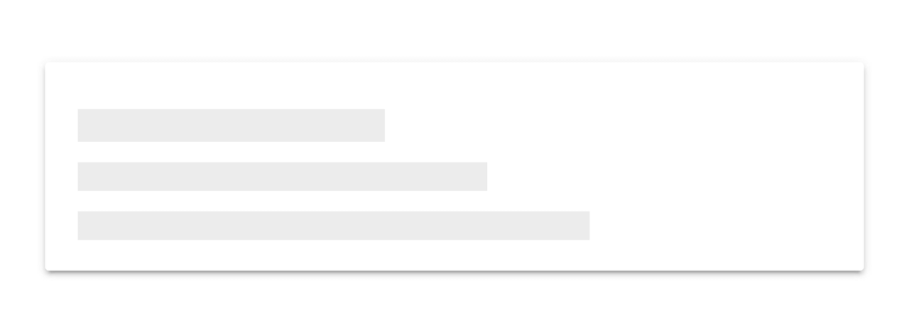
When building an app, you’re always making sure that you are doing everything correctly from a technical perspective to ensure great performance. But another, often ignored part of performance is called perceived performance. Perceived performance is how fast an action appears to happen to the user. Skeleton screens are a great way to improve the perceived performance of your app, when combined with traditional optimizations (lazy loading, code splitting, etc).

Let’s dive a little deeper into what skeleton screens are, why they are better than traditional loading spinners, and how Ionic makes it easy to use them!

Facebook is  on of the Skeleton  example. They make heavy use of skeleton screens in their native app and web app. They use a similar implementation to Medium, rendering a Skeleton Screen where content will eventually be:


One problem with that is the more people you compel to give you their time, the harder it becomes for your system to handle all that traffic.

But there is always something extra you can do to shorten the time from app start to app use for your user even if it’s just perceived as being shorter.

Let’s see the all skeleton we use :

LET THERE BE CODE

Let’s create a blank Ionic project and check a cool new feature in Ionic 4 – ion-skeleton-text.

> ionic start ion-skeleton-text blank

Let’s now go into the home.page.html file and add the content

<!-- home.page.html -->
<ion-content>
  <ion-list>
    <ion-item *ngFor="let item of items">
      {{ item }}
    </ion-item>
  </ion-list>
</ion-content>

We also need some content which we will display with some delay

// home.page.ts
export class HomePage implements OnInit {
  items: Array<string>;
  constructor() {}

  ngOnInit(): void {
    setTimeout(() => {
      this.items = [
        'Berlin',
        'Buenos Aires',
        'Madrid',
        'New York',
        'Paris',
        'Sydney',
        'Tokyo'
      ];
    }, 2500);
  }
}

If you now execute

> ionic serve

you will see something like this

                                                No loading indication

ADDING A LOADING SCREEN

In order to let the user know that something is going on in the background, we could add a loading indicator which we would remove once the data has been loaded.

// home.page.html
export class HomePage implements OnInit {
  items: Array<string>;
  constructor(private loadingController: LoadingController) {}

  ngOnInit(): void {
    this.loadData();
  }

  async loadData(): Promise<void> {
    const loading = await this.loadingController.create({
      message: 'Loading cities...'
    });

    await loading.present();

    setTimeout(() => {
      this.items = [
        'Berlin',
        'Buenos Aires',
        'Madrid',
        'New York',
        'Paris',
        'Sydney',
        'Tokyo'
      ];

      loading.dismiss();
    }, 2500);
  }
}

I won’t go into the fact that displaying a loading screen should be handled separately because that’s not the point of this post but I know you would never push code like this 😉

Now if we save and check out our browser again we will see a nice loading screen.
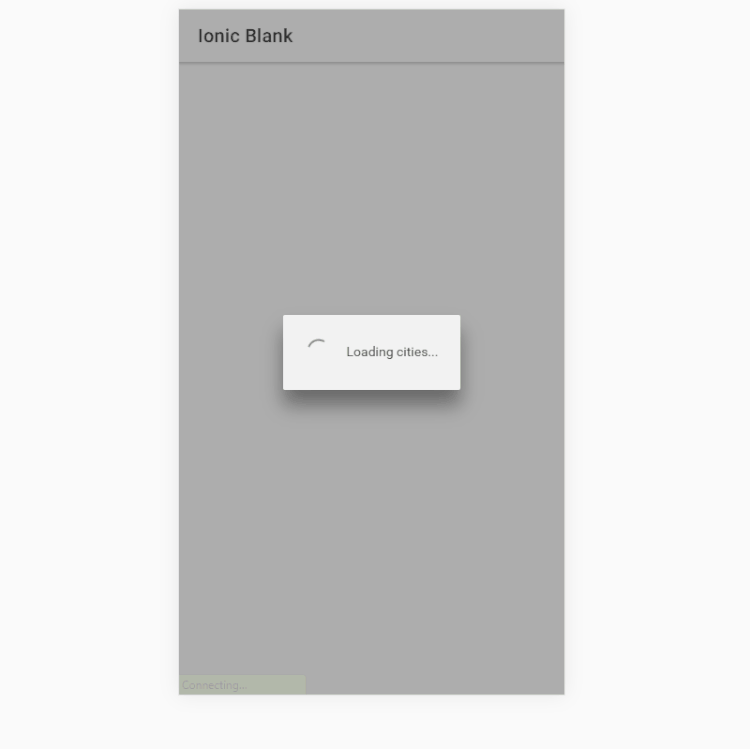
                                                Loading screen

LET’S MAKE IT A LITTLE BETTER

One thing that we know about loading screens is that we don’t really like them. Loading screens on games, apps or anywhere else is something that starts to annoy us quite quickly so we have to keep them as short as possible or remove them completely.

We can try to trick people into believing that the app is already in the process of displaying some content when in fact it’s still waiting for the server to respond. In some cases, it’s just enough to let your users feel like the app is working to make them happy.

ION-SKELETON-TEXT IS THE ANSWER

ion-skeleton-text is a new UI component which displays a placeholder content instead of the true one.

Implementing it is very straight-forward as you will see soon. Let’s dive right into it.

<!-- home.page.html -->
<ion-content>
  <ion-list *ngIf="items; else skeleton">
    <ion-item *ngFor="let item of items">
      {{ item }}
    </ion-item>
  </ion-list>
</ion-content>

<ng-template #skeleton>
  <ion-list>
    <ion-item *ngFor="let item of [50, 20, 70, 80, 50]">
      <p [ngStyle]="{ width: item + '%' }">
        <ion-skeleton-text animated></ion-skeleton-text>
      </p>
    </ion-item>
  </ion-list>
</ng-template>

What we do here is to simply show the items once they are set (after the 2500 ms) while displaying a few placeholder items in the mean-time.

We also got rid of the loading screen code again in the home.page.ts file to make it look like it was before.

// home.page.ts
export class HomePage implements OnInit {
  items: Array<string>;
  constructor() {}

  ngOnInit(): void {
    this.loadData();
  }

  async loadData(): Promise<void> {
    setTimeout(() => {
      this.items = [
        'Berlin',
        'Buenos Aires',
        'Madrid',
        'New York',
        'Paris',
        'Sydney',
        'Tokyo'
      ];
    }, 2500);
  }
}

Now if you save all you will see something like this:

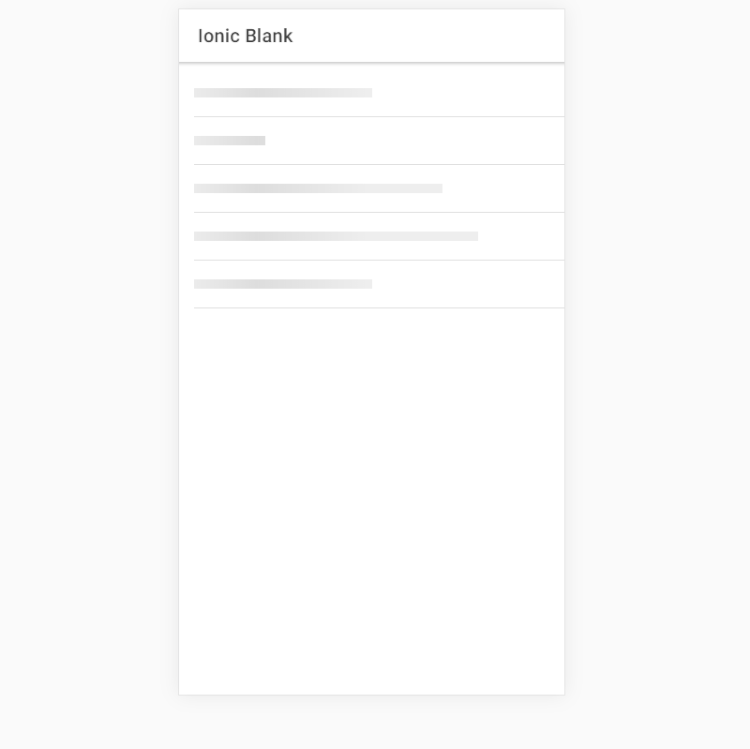
                                                Skeleton Skeleton text

This looks a lot more dynamic than having just a simple spinner and loading message. If you are displaying complex data you can even take advantage of two other cool Ionic component – ion-avatar and ion-thumbnail.

Let’s create one final skeleton-text item which will represent some more complex data.

<!-- home.page.html -->
<ion-content>
  <ion-list *ngIf="items; else skeleton">
    <ion-item *ngFor="let item of items">
      <ion-thumbnail slot="start">
        <img [src]="item.image" />
      </ion-thumbnail>
      <ion-label>
        <h3>City: {{ item.city }}</h3>
        <p>Country: {{ item.country }}</p>
        <p>Population: {{ item.population }}</p>
      </ion-label>
    </ion-item>
  </ion-list>
</ion-content>

<ng-template #skeleton>
  <ion-list>
    <ion-item *ngFor="let item of [1, 2, 3, 4, 5]">
      <ion-thumbnail slot="start">
        <ion-skeleton-text animated></ion-skeleton-text>
      </ion-thumbnail>
      <ion-label>
        <h3>
          <ion-skeleton-text animated style="width: 50%"></ion-skeleton-text>
        </h3>
        <p>
          <ion-skeleton-text animated style="width: 80%"></ion-skeleton-text>
        </p>
        <p>
          <ion-skeleton-text animated style="width: 60%"></ion-skeleton-text>
        </p>
      </ion-label>
    </ion-item>
  </ion-list>
</ng-template>

The typescript code has change also a little:

export class HomePage implements OnInit {
  items: Array<any>;
  constructor() {}

  ngOnInit(): void {
    this.loadData();
  }

  async loadData(): Promise<void> {
    setTimeout(() => {
      this.items = [
        { city: 'Berlin', country: 'Germany', population: '3.5 million', image: '...' },
        { city: 'Buenos Aires', country: 'Argentina', population: '15 million', image: '...' },
        { city: 'Madrid', country: 'Spain', population: '3.3 million', image: '...' },
        { city: 'New York', country: 'USA', population: '19.5 million', image: '...' },
        { city: 'Paris', country: 'France', population: '2.2 million', image: '...' },
        { city: 'Sydney', country: 'Australia', population: '5.4 million', image: '...' },
        { city: 'Tokyo', country: 'Japan', population: '9.2 million', image: '...' }
      ];
    }, 2500);
  }
}

The final result looks now like this:


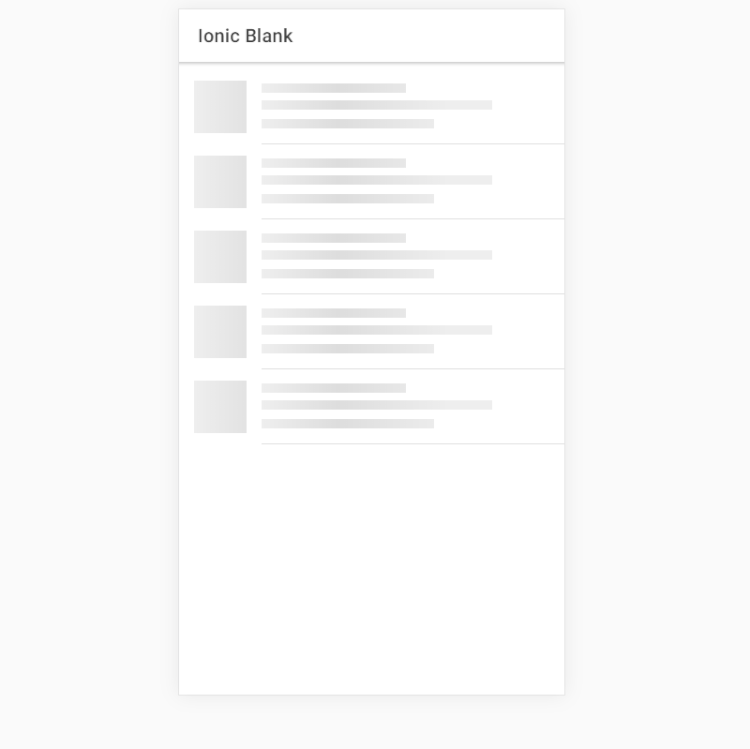
A more complex example

Now that’s pretty, isn’t it?

The ion-skeleton-text UI component can add a little twist to your app and give the user something shiny to look at while your app does all the heavy lifting. It will keep them focused on something until the final content loads fully and you are able to display it. Giving the user the feeling that the app is running instead of waiting will make them come back and will give you more users to serve.

SatishHow to use ion-skeleton-text in Ionic 4
read more

Laravel Validation

No comments

Validation is one of the fundamental elements of any application. Laravel Framework provides several approaches to validate incoming user data. ValidatesRequests Trait is used by Laravel’s Base Controller to validate incoming HTTP requests. It also supports a variety of powerful rules.

# Adding Validations

To add validation logic to check user data, we use the validate method provided by the Illuminate\Http\Request object. This is because we can fetch user input data with the Request class.
The code continues execution normally if the validation rules pass. But if the validation fails, an exception is thrown and the user is informed with an automatic error message. For a better perspective, let us write some validation rules:

# controller

   public function store(Request $request)
{
$request->validate([
'title' => 'required|unique:posts|max:255',
'category' => 'required',
]);
}

# Validating Nested Parameters

In case HTTP layout or request comprise of nested parameters, we can specify them with a “.“(dot) operator in the validation rules like:

# controller
public function store(Request $request)
{
$request->validate([
'title' => 'required|max:255',
'author.name' => 'required',
'author.contact' => 'required',
]);
}

# Displaying Validation Errors

The next step is to determine a way to handle exceptions thrown on validation failures. As we discussed earlier, Laravel automatically sends an error message. It also redirects the user to the previous location where the error is supposed to be rectified. Additionally, Laravel also flashes these messages on sessions so that we can have global access to them amidst controllers and layout views.

This eliminates the need to explicitly bind the error messages to views or routes. Laravel keeps a check on session error data and automatically binds them to views if available.

Let us see how we can utilize these session error messages to display to our users through views:

# blade


@if ($errors->any())
<div class="alert alert-danger">
<ul>
@foreach ($errors->all() as $error)
<li>{{ $error }}</li>
@endforeach
</ul>
</div>
@endif

we have a new validation option: image dimensions for image uploads. The validation rule is called dimensions, and you can pass the following parameters to it:

min_width: Images narrower than this pixel width will be rejected
max_width: Images wider than this pixel width will be rejected
min_height: Images shorter than this pixel height will be rejected
max_height: Images taller than this pixel height will be rejected
width: Images not exactly this pixel width will be rejected
height: Images not exactly this pixel height will be rejected
ratio: Images not exactly this ratio (width/height, expressed as “width/height”) will be rejected

You can combine any rules that make sense together. Let’s take a look at a few examples. First, let’s set up our base install.

// routes file
Route::get('/', function () {
return view('form');
});


Route::post('/', 'ImageController@postImage');

//form.blade.php

<form method="POST" enctype="multipart/form-data">
<input type="file" name="avatar">
<input type="submit">
</form>

Now, let’s make our ImageController and take a look at a few sample validations.

// ImageController
public function postImage(Request $request)
{
$this->validate($request, [
'avatar' => 'dimensions:min_width=250,min_height=500'
]);

// or…

$this->validate($request, [
'avatar' => 'dimensions:min_width=500,max_width=1500'
]);

// or…

$this->validate($request, [
'avatar' => 'dimensions:width=100,height=100'
]);

// or…

// Ensures that the width of the image is 1.5x the height
$this->validate($request, [
'avatar' => 'dimensions:ratio=3/2'
]);
}

SatishLaravel Validation
read more

Liferay : Overwrite Cache-Control headers in Document Library files

No comments
DLFileEntry from Document library are downloaded from WebServerServlet, that is adding Cache-Control: private header but no other caching instruction (like max-age or Expires) is appended.

ServletResponseUtil will override the Cache-Control header, no matter what was set before. In this particular case, when trying to modify the header using the HeaderFilter will fail because the portal will override it with a hard-coded value later on.

Overwrite Cache-Control headers settings.

  1. Shut down the portal.
  2. Edit the <tomcat_home>/webapps/ROOT/WEB-INF/liferay-web.xml
  3. Add the following filter mapping:
V3A InfoLiferay : Overwrite Cache-Control headers in Document Library files
read more

Digital Transformation : Liferay DXP

No comments

The ultra-modern Liferay DXP is one of the best technology platform options available for an organization’s digital transformation. Liferay DXP platform for multiple perspectives – market positioning to begin with but more importantly being better aligned to affect change at all stages of the customer journey, while also enabling partners and employees to interact with customers to influence sentiment and support the relationship.

Successful digital businesses require platforms that are built on solid, reliable IT. The Liferay platform has been improved with features like modular architecture, a more powerful search engine, and better tools for testing and upgrades.


MODULARITY

Liferay DXP’s modular architecture gives businesses extensibility unthinkable until now and an elegant development model.Modularity means all features and functionalities are now available in little pieces distributed into enormous modules. While Liferay earlier used to be a single large monolithic application, it now comprises of multiple JARs. Liferay DXP’s new modular architecture empowers businesses to build powerful, adaptable, lightweight and innovative systems for the digital world.

MODULARITY

Modern Web Experiences

Web experience features provide support for creating and managing web experiences, including audience targeting for marketing campaigns, content authoring, geolocation and staging tools. Liferay DXP is designed to support omnichannel experiences, including digital touchpoints across web, mobile and connected devices. Create consistent, personalized experiences quickly and easily.

Audience Targeting

It contains advanced segmentation of audiences with new segmentation rules. Visitor segments can be created based on user profile custom fields, user language, IP address, sign up date and last login date. A report builder is available to generate reports for segments and campaigns. Additional reporting capabilities include the ability to view and download the list of users of each segment. Finally, targeted assets can be filtered in the Asset Publisher using advanced filtering settings.


Audience Targeting

Modern, Fast Site Creation

A creating dynamic and visually stunning sites provides more power to administrators for faster site creation. A latest set of modern themes and site templates available in Liferay. Which build the foundation for quickly creating your websites with modern features.

Simple Content Authoring with Alloy Editor

Liferay’s powerful authoring applications thanks to Alloy Editor is one of project from Liferay and it has provided better way of edit and create web content in Liferay.

It includes the ability to preview source written in HTML as its being typed live, which makes it simple to add new content using only the source code. Alloy Editor uses a context aware toolbar that stays out of the way until it is needed.

Content Authoring with Alloy Editor

Inline Image Editor

The ability to upload a picture, select an uploaded file, and even take a picture or video to add to your content is now easy with Liferay DXP ‘s new media selector. It allows for simple image editing directly from within Liferay, eliminating the need for an external tool while creating content. Easily resize, crop and make colors adjustments to any image uploaded to Documents and Media from within blogs or any other application that uses an item selector. The image editor is easy to customize and allows developers to create and deploy tools that modify images.

Web Content Diffs

Web Content can now compare different versions of content, just as users can in the Wiki portlet. Web Content can also be compared when the content is being processed through a workflow. This makes it easier for the content approver to review the changes before approving them.

Site Content Sharing

Liferay DXP now has the capability to share various content pieces between child and parent sites. As the administrator of a child site, you will be able to use all the structures, templates, categories, application display templates and more from any of your parent sites that allows for it.

Elastic Search

Dynamic, extensible search is built-in. Elasticsearch, the market-leading open source search engine for modern web applications, is the default search engine in Liferay DXP and provides better search monitoring, tuning and scaling. Search capability is extensible using open search, or swapping in a different search engine like Solr.

Improved Collaboration + Document Management

Collaboration in Liferay DXP is supported with improved applications for blogs and social networking, as well as a solid set of tools for forums, message boards and other functionalities.

  • Blogs experience– Improvements to the blog experience include the ability to set cover images and more convenient and reliable image uploading and sharing, along with additional features for RSS support, threaded user and guest comments, tags and labels, social bookmarking links, email notifications of blog replies and an entry rating system.
  • Social Collaboration Apps– Microblogs, contact center, announcements, ability to invite members and other social collaboration features are now available out-of-the-box through multiple dedicated apps.
  • User Mentions– Users can now @mention another user within blogs and comments. Mentioned users will receive a notification that they have been mentioned in that particular asset.

Enterprise-Ready Forms

A brand new application for defining and publishing advanced dynamic forms allows for complex multicolumn layouts and the ability to span several pages. The new application offers more control over form fields, such as the ability to customize fields or hide them with visibility expressions. Forms can be published in any Liferay site simply by dropping the form into a page or providing a URL that links directly to a full page form. An additional feature is the ability to pull in data from an external source (i.e., “Data Providers”). Once the administrator configures the Data Provider, the data can be shared across any form. On the roadmap is the ability to use the Forms API to render the form engine, even for sites that use Liferay Forms alongside another technology.

DXP Form

Exceptional Mobile Experiences

The new suite consists of a collection of existing mobile-enabling software:

Mobile SDK, Liferay Screens and Liferay Push. The updated mobile tools enable you to create applications for collaboration and social, while ensuring that the information on your phone remains completely secure.

Mobile Experiences
New features in Liferay Mobile Experience include:

  • .A new set of screenlets for Liferay Screens, including Image Gallery, Blogs,Comments, Ratings, Generic Asset Display, PDF Display, Video Display,Audio Display and Image Display.
  • Enterprise security features such as database encryption. All stored data will now been crypted in the phone’s local database.
  • Improved support for structured web content in the Web Content Screenlet.
V3A InfoDigital Transformation : Liferay DXP
read more

UX / UI : Process and Design

No comments

User experience (UX) design is the process of creating products that provide meaningful and personally relevant experiences. This involves the careful design of both a product’s usability and the pleasure consumers will derive from using it. It is also concerned with the entire process of acquiring and integrating the product, including aspects of branding, design, usability, and function.

An important concept in UX design is the process by which users form experiences. When first encountering a product, a user forms a momentary impression—which evolves over time, typically as the product is used throughout a period. In this process, the user’s perception, action, motivation, and cognition integrate to form a memorable and coherent story: called “the user experience.” This process elicits emotional responses, which largely determine whether the experience will be considered positive or negative.

UX design refers to user experience design, while UI design stands for user interface design. Both of these are crucial to an IT product and need to work closely together.
Despite being very integral to each other, the roles themselves are quite different, involving distinct processes.

UX designers are generally focused on development of digital products, but the theory and process can be applied to just about anything:

Strategy and Context:

  • Competitor Analysis
  • Customer Analysis
  • Product Structure/Strategy
  • Content Development

Wireframing and Prototyping:

  • Wireframing
  • Prototyping
  • Testing/Iteration
  • Development Planning

Execution and Analytics

  • Coordination with UI UX Designer(s)
  • Coordination with Developers
  • Tracking Goals and Integration
  • Analysis and Iteration

User Interface (UI)

User Interface (UI) design is a large field. In theory, UI is a combination of content (documents, texts, images, videos, etc), form (buttons, labels, text fields, check boxes, drop-down lists, graphic design, etc), and behavior (what happens if I click/drag/type).

Things to remember about creating delightful UI

  1. On a screen, people will always read the biggest, the boldest, and the brightest first. This is human nature. Our attention is programmed in such a way where we see the biggest, the boldest, and the brightest first. And then it moves to smaller, less bold, and less bright things. As a designer, you can use this information to curate the experience of your user.
  2. The Importance of Alignment. Alignment is a fundamental aspect of UI Design. And an important design principle is: minimize the number of alignment lines. It improves readibility and makes the design more pleasing to the eye. Creating a great UI is a challenge, especially because it has to be intuitive.

Look and Feel:

  • Customer Analysis
  • Design Research
  • Branding and Graphic Development
  • User Guides/Story line

Responsiveness and Interactivity:

  • UI Prototyping
  • Interactivity and Animation
  • Adaptation to All Device Screen sizes
  • Implementation with Developer
V3A InfoUX / UI : Process and Design
read more