User Experience

What’s New Features Introduced In Ionic 4

No comments

Ionic is one of the best frameworks in the market, It’s open source SDK for developing the Hybrid Mobile Application. There are basically three components such as:

1. A Sass-based UI structure that is specially optimized for mobile UIs.
2. An Angular platform that is helpful in quick scalable app creation.
3. A compiler (Cordova or PhoneGap) or wrapper that is utilized for developing native apps using CSS, JavaScript, and HTML.

New Components Introduced In Ionic 4

Components for the Web:

Web Component are a set of web platform APIs allowing you to create custom, reusable, encapsulated HTML tags to use in web pages.

It is the most significant change as they moved to a web component for each component. Web components are nothing but a set of web platform APIs that can let the developer create reusable, new, or custom encapsulated HTML tags that can use in web application and pages.

Web Components are based on the following specifications:
  • Custom Elements: defines the bases and the fundamentals to design and use new types of DOM elements.
  • Shadow DOM: defines how to use encapsulated styles and markup within a web component.
  • HTML imports: defines how to include and reuse the HTML document in another HTML document.
  • HTML Template: defines how to declare code fragments that will not be used while the page is loading, but could be later instantiated at runtime.

Capacitor:

Capacitor is a cross-platform API and code execution layer that makes it easy to call Native SDKs from web code and to write custom Native plugins required by the app.It also consists of PWA support to enable the developer to write one app and then launch it to the app store.

Stencil:

This new creation of the Ionic team is a web component compiler that is useful for building standards-compliant with web servers. This also uses additional APIs such as TypeScript, JSX, async, and Virtual DOM, which works best for progressive web apps (PWA).

Ion-backdrop:

They are full-screen components which overlay other components.These are placed on top of the other contents, as this way it is able to dismiss another component.

ion-picker:

A Picker displays a row of buttons and columns on top of the app’s content, and at the bottom of the viewport.
> Picker-column
> Picker controller

ion-Ripple Effect:

The ripple effect component adds the Material Design ink ripple interaction effect. It is designed to be efficient, noninvasive, and usable without adding any extra DOM to your elements. It works without javascript degrades to easier CSS-Only implementation.

ion-Route:

It will pick up a component and will render it browser URL gets matched with URL property.

ion-Searchbar:

This includes a text field which is useful for searching from a huge collection. Here, the team of Ionic has added nine bar styles, and out of them all, v4 appears to be the best.
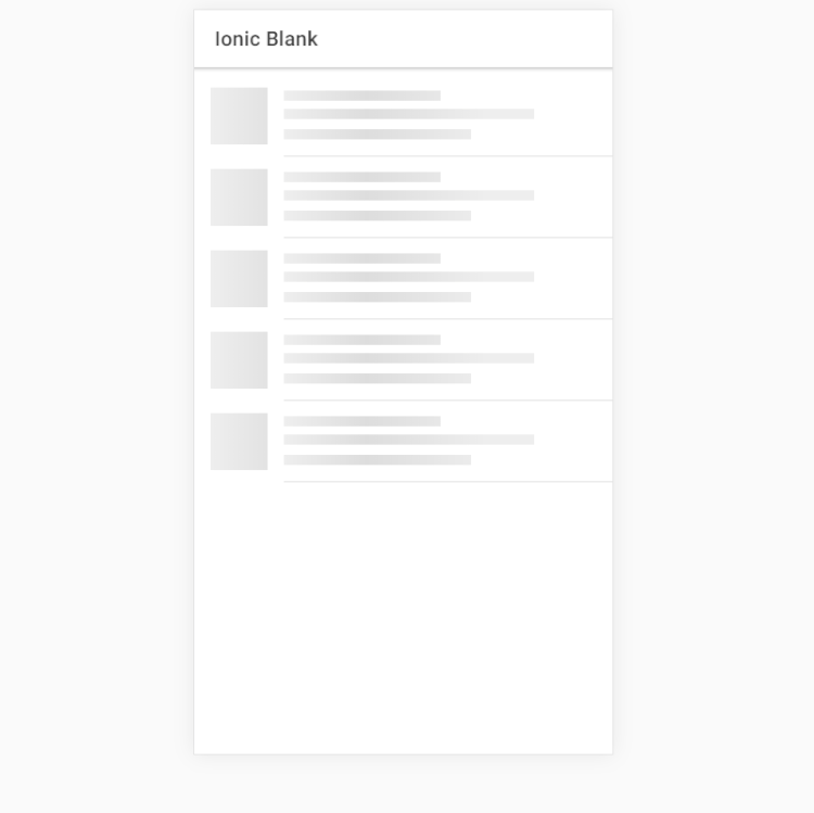
ion-skeleton-text:

Skeleton Text is for rendering placeholder content. It will render a gray block at the specified width.


ion-select Popover:

This mainly is a dialogue appearing on top of the current page, and it is used for the overflow actions that do not fit well in the navigation bar.

Ionicons 4.0:

Premium designed icons for use in web, iOS, Android, and desktop apps. Support for SVG and web font now available and distributed as web components with drastically reduced sizes, and brand new icon forms reflecting the latest iOS and Material Design styles.

Tappable Items:

To list items, we were used <button> in v3 but in v4 has the tappable attribute for an <ion-item>.

<ion-item tappable (click)="writeSomething()">

Your Button Item

</ion-item>

CSS Variables:

This is the exclusive feature of Ionic that is going to modernise the whole look of your application making some slight changes in a few variables without even using the build tools.

Color Changes:

The Ionic team has changed the earlier default color and it now has a new default color.

ion-reorder:

Reorder allows items to be dragged to change its order horizontally. It can be used within an ion-reorder-group to provide a visual drag and drop interface.

Lazy Loading:

It is basically a design pattern in the ionic framework which is used to distinguish initialization of the components until it is required. This will help to improve the performance of the app and decrease the load time of the app by dividing it into various bundles and loading the app when asked for.

Ion-show-when:

It shows child content when a query evaluates to true. It can watch for platform changes, mode changes, CSS media queries, and device orientation.

Ionic Native 5:

Ionic Native 5 brings the app development project to the fully framework agnostic status. where our components work with either framework or without a framework. Ionic native 5 requires Angular 5 for those choosing to use injectables/providers.

Changelogs in Native 5:

Changelogs is basically shipped with three bundles, i.e.
>  Angular (5.x+) providers
>  ES6 modules
>  AngularJS support
The bundle releases and ES6 will feature static classes for plugins. Ionic developers who use Angular choose between using the injectables, or can import & use ES6 plugins statically.

SatishWhat’s New Features Introduced In Ionic 4
read more

New feature in Liferay 7.2!

No comments

Now a days Digital experience has been change a lot. Its help in business to reach on new success. Liferay Portal play a important role in this day by day. In older version also Liferay put great effort in term of digital experience. in this version Its make more sharpen. Liferay is easy to use and build tailored solution for business.
Lets dig in new feature here..

Create Experiences

In this version Liferay made more easier experience for a business user to create a content so he can build content flawless and without any obstetrical.  For Developer also its made easier to quickly creates fragments with export import features. Content Sets utilize the power asset publisher and decoupling it from the widget itself. Now content can be dynamically or manually selected for personalized content sets and be exposed through APIs.

Users can easily drag and drop widgets, fragments or content to build pages. In this version, content authoring, interface and web experience creation have made the process even more easy or can say user friendly for business users to create visually pages with less effort. Now, preview of content within an associated display page before publishing is also provided.

Personalized Experiences

Personalized Experience feature help marketers to create personalized page experience for a  different customer to make them easily achieve their business requirement using the fragments, navigation, content and widget with tailored made solution is also available. We can integrates it with Liferay Analytics Cloud also which make it more strong it.

A few of these segmentation rules include personalizing according to device, cookie, URL and content visited, among others.

On DXP 7.2, users have even more powerful tools available to personalize and target content on web pages and fragments. Automate content personalization based on user behavior with interest-based content recommendations.

Go Headless

Headless feature is a one of the awesome feature of Liferay DXP. Cleaner omnichannel experience for customers and add content with ease and without limitations.

As a decoupled CMS and persentation layer, Liferay DXP gives developers the freedom to create any presentation layer without compromising on the benefits of a traditional CMS, helping businesses advance their customer experience. With a hybrid CMS, content management is detached from the front-end with an API so users can publish content across multiple channels freely without needing new front-end templates every time.

Using APIs, users can create and manage in Liferay and push information to other platforms without any manipulations. These APIs interacts with Liferay’s permission model so that users are still receiving the information that is relevant to them even if displayed outside of the Liferay platform.

Manage Bulk Digital Assets Effectively

Liferay help a lot to manage a content. In this version Liferay work on mange a bulk content with the help of bulk or auto tagging, UI/UX, Auto versioning and removing duplicate content or asset. Which save time and money and help to growing your business. Manage digital assets and files at scale with these features available on Liferay DXP:

Assets Bulk Management : Its manage bulk digital assets and files like tagging, categorization, and operation on files like moving , deleting. Bulk management save a time so you can invest that time in grow your business.

Auto-Tagging: Auto-tagging is a very existing feature for a user. While a user upload a content or file its tag automatically. which make life easier of a user. The platform also provides an Auto-Tagging API, whereby you can tag any asset with any service for your use case by leveraging an API built for extending auto-tagging functionality. Tagging is critical because it helps with search.

Automatic Versioning Policies:Versioning of a document was already given in  Liferay but in this version of Liferay DXP add the ability to user to create a Versioning Policy. The functionality for versioning has been expanded to allow users to define their own versioning policies and apply them to Liferay DXP. In Liferay DXP 7.2, intelligent/definable versioning is introduced, which is used to enrich historical and auditing context of a document’s lifecycle.

V3A InfoNew feature in Liferay 7.2!
read more

How to use FTP in Ionic 4

No comments

FTP (File Transfer Protocol)

File Transfer Protocol (FTP) is a standard Internet protocol for transmitting files between computers on the Internet over TCP/IP connections. FTP is a client-server protocol where a client will ask for a file, and a local or remote server will provide it.

How FTP works

FTP is a client-server protocol that relies on two communications channels between client and server: a command channel for controlling the conversation and a data channel for transmitting file content. Clients initiate conversations with servers by requesting to download a file. Using FTP, a client can upload, download, delete, rename, move and copy files on a server. A user typically needs to log on to the FTP server, although some servers make some or all of their content available without login, known as anonymous FTP.

cordova-plugin-ftp

This cordova plugin is created to use ftp (client) in web/js.

Support both iOS and Android platform now.

You can do the following things:

  • List a directory
  • Create a directory
  • Delete a directory (must be empty)
  • Delete a file
  • Download a file (with percent info)
  • Upload a file (with percent info)
  • Cancel upload/download

Installation

$ionic cordova plugin add cordova-plugin-ftp
$npm install @ionic-native/ftp

Dependency:

  • For iOS, the plugin depends on CFNetwork.framework, which has been added to plugin.xml (and cordova prepare will add it to platform project), so you don’t need to do anything.
  • But for Android, it depends on com.android.support:support-v4:23.2.0, which should be added to your platform project by hand.

Usage

How to connect FTP:

For better use of FTP connect once to server means connect to one ftp server.

Just need to init the connection once. If success, you can do any ftp actions later.

connect(hostname, username, password)

import { FTP } from '@ionic-native/ftp/ngx';


constructor(private ftp: FTP) { }

...


this.ftp.connect('ftp_host', 'ftp_user', 'ftp_password')
  .then((res: any) => console.log('Login successful', res))
  .catch((error: any) => console.error(error));
Param Details
hostname The ftp server url. Like ip without protocol prefix, e.g. “192.168.1.1”. Use only the Host name or ip-address
username The ftp login username. If it and password are all blank/undefined, the default username “anonymous” is used.
password The ftp login password. If it and username are all blank/undefined, the default password “anonymous@” is used.

Returns: Promise<any> The success callback. Notice: For iOS, if triggered, means init success, but NOT means the later action, e.g. ls… download will success!

How to upload a File:

Upload one local file to the ftp server after connect the ftp server.

this.ftp.upload(localFile, remoteFile).subscribe(
(result) => {
     console.log(result);
} , (error) => {
     console.log(error);
});
Param Details
localFile The file (with full path) you want to upload. e.g. “/local/path/localFile”.
remoteFile The file (with full path) you want to located on the ftp server. e.g. “/123/newDir/remoteFile”.

Returns:Observable<any> Returns an observable. It will be triggered many times according the file’s size. The arg 00.1xx0.2xx … 1 means the upload percent. When it reach 1, means success.

List files:

List files (with info of nametypelinksizemodifiedDate) under one directory on the ftp server. You can get one file’s name using fileList[x].name (x is the location in array).

this.ftp.ls(path);

Param Details
path The path on the ftp server. e.g. “/adf/123/”.

Returns: Promise<any> Returns a promise

Create & Delete directory:

1. mkdir(path)

Create one directory on the ftp server.

Param Details
path The path on the ftp server. e.g. “/adf/123/”.

Returns: Promise<any> Returns a promise

2. rmdir(path)

Delete one directory on the ftp server.

Tip: As many ftp server could not rm dir when it’s not empty, so rm all files under the dir at first is recommended.

Param Details
path The file (with full path) you want to delete. e.g. “/123/newDir/myFile”.

Returns: Promise<any> Returns a promise

3. rm(file)

Delete one file on the ftp server.

Param Details
file The file (with full path) you want to delete. e.g. “/123/newDir/myFile”.

Returns: Promise<any> Returns a promise

How to download a File:

Download one remote file on the ftp server to local path.

this.ftp.download(localFile, remoteFile).subscribe(
(result) => {
     console.log(result);
} , (error) => {
     console.log(error);
});
Param Details
localFile The file (with full path) you want to upload. e.g. “/local/path/localFile”.
remoteFile The file (with full path) you want to located on the ftp server. e.g. “/123/newDir/remoteFile”.

Returns: Observable<any> Returns an observable. It will be triggered many times according the file’s size. The arg 00.1xx0.2xx … 1 means the upload percent. When it reach 1, means success.

cancel()

Cancel all requests. Always success.

Returns: Promise<any> Returns a promise

disconnect()

Disconnect from ftp server.

Returns: Promise<any> Returns a promise

SatishHow to use FTP in Ionic 4
read more

How to use ion-skeleton-text in Ionic 4

No comments

ion-skeleton-text

Skeleton Text is a component for rendering placeholder content. The element will render a gray block at the specified width.

Skeleton screens… You might think they sound a little scary and or that they’re hard to implement, but what if I told you that they are actually quite simple to make. Once added to your app, skeleton screens become an awesome feature to make your app feel incredibly fast.
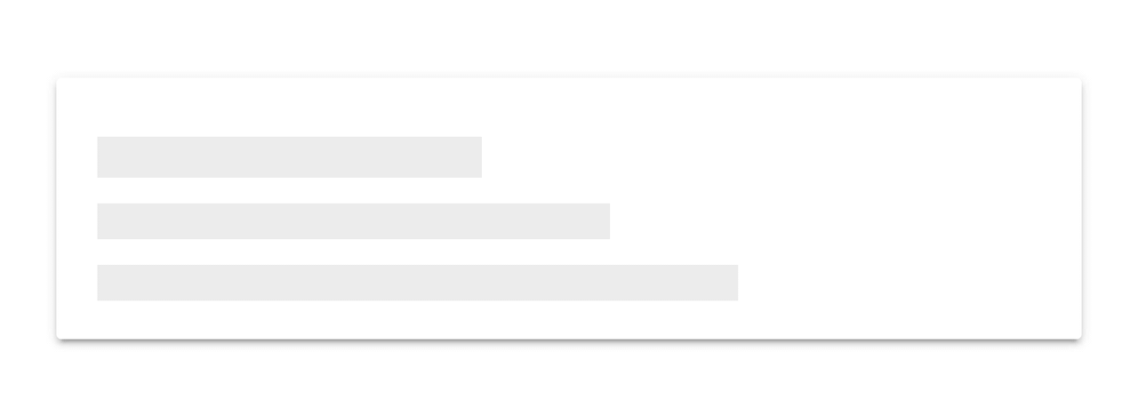
When building an app, you’re always making sure that you are doing everything correctly from a technical perspective to ensure great performance. But another, often ignored part of performance is called perceived performance. Perceived performance is how fast an action appears to happen to the user. Skeleton screens are a great way to improve the perceived performance of your app, when combined with traditional optimizations (lazy loading, code splitting, etc).

Let’s dive a little deeper into what skeleton screens are, why they are better than traditional loading spinners, and how Ionic makes it easy to use them!

Facebook is  on of the Skeleton  example. They make heavy use of skeleton screens in their native app and web app. They use a similar implementation to Medium, rendering a Skeleton Screen where content will eventually be:


One problem with that is the more people you compel to give you their time, the harder it becomes for your system to handle all that traffic.

But there is always something extra you can do to shorten the time from app start to app use for your user even if it’s just perceived as being shorter.

Let’s see the all skeleton we use :

LET THERE BE CODE

Let’s create a blank Ionic project and check a cool new feature in Ionic 4 – ion-skeleton-text.

> ionic start ion-skeleton-text blank

Let’s now go into the home.page.html file and add the content

<!-- home.page.html -->
<ion-content>
  <ion-list>
    <ion-item *ngFor="let item of items">
      {{ item }}
    </ion-item>
  </ion-list>
</ion-content>

We also need some content which we will display with some delay

// home.page.ts
export class HomePage implements OnInit {
  items: Array<string>;
  constructor() {}

  ngOnInit(): void {
    setTimeout(() => {
      this.items = [
        'Berlin',
        'Buenos Aires',
        'Madrid',
        'New York',
        'Paris',
        'Sydney',
        'Tokyo'
      ];
    }, 2500);
  }
}

If you now execute

> ionic serve

you will see something like this

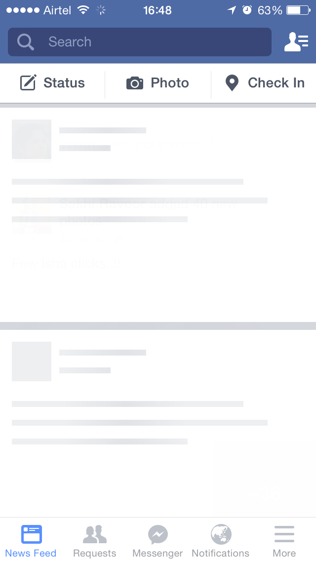
                                                No loading indication
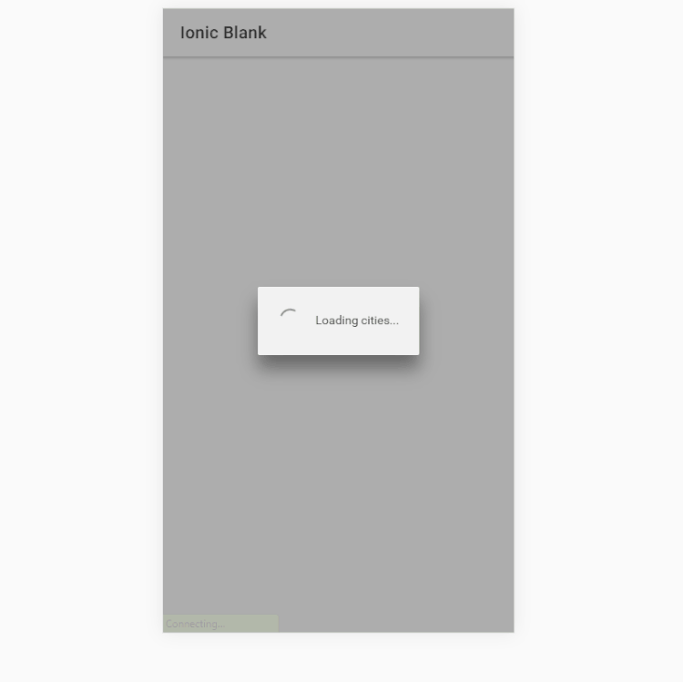
ADDING A LOADING SCREEN

In order to let the user know that something is going on in the background, we could add a loading indicator which we would remove once the data has been loaded.

// home.page.html
export class HomePage implements OnInit {
  items: Array<string>;
  constructor(private loadingController: LoadingController) {}

  ngOnInit(): void {
    this.loadData();
  }

  async loadData(): Promise<void> {
    const loading = await this.loadingController.create({
      message: 'Loading cities...'
    });

    await loading.present();

    setTimeout(() => {
      this.items = [
        'Berlin',
        'Buenos Aires',
        'Madrid',
        'New York',
        'Paris',
        'Sydney',
        'Tokyo'
      ];

      loading.dismiss();
    }, 2500);
  }
}

I won’t go into the fact that displaying a loading screen should be handled separately because that’s not the point of this post but I know you would never push code like this 😉

Now if we save and check out our browser again we will see a nice loading screen.

                                                Loading screen

LET’S MAKE IT A LITTLE BETTER

One thing that we know about loading screens is that we don’t really like them. Loading screens on games, apps or anywhere else is something that starts to annoy us quite quickly so we have to keep them as short as possible or remove them completely.

We can try to trick people into believing that the app is already in the process of displaying some content when in fact it’s still waiting for the server to respond. In some cases, it’s just enough to let your users feel like the app is working to make them happy.

ION-SKELETON-TEXT IS THE ANSWER

ion-skeleton-text is a new UI component which displays a placeholder content instead of the true one.

Implementing it is very straight-forward as you will see soon. Let’s dive right into it.

<!-- home.page.html -->
<ion-content>
  <ion-list *ngIf="items; else skeleton">
    <ion-item *ngFor="let item of items">
      {{ item }}
    </ion-item>
  </ion-list>
</ion-content>

<ng-template #skeleton>
  <ion-list>
    <ion-item *ngFor="let item of [50, 20, 70, 80, 50]">
      <p [ngStyle]="{ width: item + '%' }">
        <ion-skeleton-text animated></ion-skeleton-text>
      </p>
    </ion-item>
  </ion-list>
</ng-template>

What we do here is to simply show the items once they are set (after the 2500 ms) while displaying a few placeholder items in the mean-time.

We also got rid of the loading screen code again in the home.page.ts file to make it look like it was before.

// home.page.ts
export class HomePage implements OnInit {
  items: Array<string>;
  constructor() {}

  ngOnInit(): void {
    this.loadData();
  }

  async loadData(): Promise<void> {
    setTimeout(() => {
      this.items = [
        'Berlin',
        'Buenos Aires',
        'Madrid',
        'New York',
        'Paris',
        'Sydney',
        'Tokyo'
      ];
    }, 2500);
  }
}

Now if you save all you will see something like this:

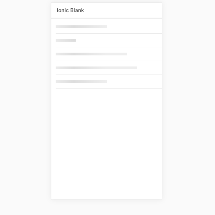
                                                Skeleton Skeleton text

This looks a lot more dynamic than having just a simple spinner and loading message. If you are displaying complex data you can even take advantage of two other cool Ionic component – ion-avatar and ion-thumbnail.

Let’s create one final skeleton-text item which will represent some more complex data.

<!-- home.page.html -->
<ion-content>
  <ion-list *ngIf="items; else skeleton">
    <ion-item *ngFor="let item of items">
      <ion-thumbnail slot="start">
        <img [src]="item.image" />
      </ion-thumbnail>
      <ion-label>
        <h3>City: {{ item.city }}</h3>
        <p>Country: {{ item.country }}</p>
        <p>Population: {{ item.population }}</p>
      </ion-label>
    </ion-item>
  </ion-list>
</ion-content>

<ng-template #skeleton>
  <ion-list>
    <ion-item *ngFor="let item of [1, 2, 3, 4, 5]">
      <ion-thumbnail slot="start">
        <ion-skeleton-text animated></ion-skeleton-text>
      </ion-thumbnail>
      <ion-label>
        <h3>
          <ion-skeleton-text animated style="width: 50%"></ion-skeleton-text>
        </h3>
        <p>
          <ion-skeleton-text animated style="width: 80%"></ion-skeleton-text>
        </p>
        <p>
          <ion-skeleton-text animated style="width: 60%"></ion-skeleton-text>
        </p>
      </ion-label>
    </ion-item>
  </ion-list>
</ng-template>

The typescript code has change also a little:

export class HomePage implements OnInit {
  items: Array<any>;
  constructor() {}

  ngOnInit(): void {
    this.loadData();
  }

  async loadData(): Promise<void> {
    setTimeout(() => {
      this.items = [
        { city: 'Berlin', country: 'Germany', population: '3.5 million', image: '...' },
        { city: 'Buenos Aires', country: 'Argentina', population: '15 million', image: '...' },
        { city: 'Madrid', country: 'Spain', population: '3.3 million', image: '...' },
        { city: 'New York', country: 'USA', population: '19.5 million', image: '...' },
        { city: 'Paris', country: 'France', population: '2.2 million', image: '...' },
        { city: 'Sydney', country: 'Australia', population: '5.4 million', image: '...' },
        { city: 'Tokyo', country: 'Japan', population: '9.2 million', image: '...' }
      ];
    }, 2500);
  }
}

The final result looks now like this:


A more complex example

Now that’s pretty, isn’t it?

The ion-skeleton-text UI component can add a little twist to your app and give the user something shiny to look at while your app does all the heavy lifting. It will keep them focused on something until the final content loads fully and you are able to display it. Giving the user the feeling that the app is running instead of waiting will make them come back and will give you more users to serve.

SatishHow to use ion-skeleton-text in Ionic 4
read more

UX / UI : Process and Design

No comments

User experience (UX) design is the process of creating products that provide meaningful and personally relevant experiences. This involves the careful design of both a product’s usability and the pleasure consumers will derive from using it. It is also concerned with the entire process of acquiring and integrating the product, including aspects of branding, design, usability, and function.

An important concept in UX design is the process by which users form experiences. When first encountering a product, a user forms a momentary impression—which evolves over time, typically as the product is used throughout a period. In this process, the user’s perception, action, motivation, and cognition integrate to form a memorable and coherent story: called “the user experience.” This process elicits emotional responses, which largely determine whether the experience will be considered positive or negative.

UX design refers to user experience design, while UI design stands for user interface design. Both of these are crucial to an IT product and need to work closely together.
Despite being very integral to each other, the roles themselves are quite different, involving distinct processes.

UX designers are generally focused on development of digital products, but the theory and process can be applied to just about anything:

Strategy and Context:

  • Competitor Analysis
  • Customer Analysis
  • Product Structure/Strategy
  • Content Development

Wireframing and Prototyping:

  • Wireframing
  • Prototyping
  • Testing/Iteration
  • Development Planning

Execution and Analytics

  • Coordination with UI UX Designer(s)
  • Coordination with Developers
  • Tracking Goals and Integration
  • Analysis and Iteration

User Interface (UI)

User Interface (UI) design is a large field. In theory, UI is a combination of content (documents, texts, images, videos, etc), form (buttons, labels, text fields, check boxes, drop-down lists, graphic design, etc), and behavior (what happens if I click/drag/type).

Things to remember about creating delightful UI

  1. On a screen, people will always read the biggest, the boldest, and the brightest first. This is human nature. Our attention is programmed in such a way where we see the biggest, the boldest, and the brightest first. And then it moves to smaller, less bold, and less bright things. As a designer, you can use this information to curate the experience of your user.
  2. The Importance of Alignment. Alignment is a fundamental aspect of UI Design. And an important design principle is: minimize the number of alignment lines. It improves readibility and makes the design more pleasing to the eye. Creating a great UI is a challenge, especially because it has to be intuitive.

Look and Feel:

  • Customer Analysis
  • Design Research
  • Branding and Graphic Development
  • User Guides/Story line

Responsiveness and Interactivity:

  • UI Prototyping
  • Interactivity and Animation
  • Adaptation to All Device Screen sizes
  • Implementation with Developer
V3A InfoUX / UI : Process and Design
read more